I had such a fun time designing the opening credits sequence! I remember, at the big premiere in Joseph Theater, the room was pulsing with electric anticipation: I'm very proud of the steady, stylistic climb throughout the Overture.
Surprisingly, the idea of placing a Rating card at the very beginning was a last-minute decision. I figured, I wanted to warn/prepare the audience in some way; I didn't want anyone to enter the movie cold. This is why each public screening was preceded by a short oral presentation. I'm a big fan of avant garde artwork, so I used a common strategy known as "defamiliarization," by taking conventional images and subverting them. Thus, the completely fabricated F Rating.

Still on the reflexivity kick, the camera countdown draws more attention to the medium. I wanted people to know that this is obviously a movie, which in hindsight, may not have been the best decision because it separates the viewer from the action. Mainly, the purpose of using that stock footage was purely stylistic. From concept to execution, my mission was to prove that documentaries could be just as stylish as narrative-driven features. I guess I'd describe my style as "neo-glam," a term borrowed from the Glam Rock Movement.
Ironically, the opening battlefield shots were actually the second-to-last shots of the entire shoot. They were definitely the easiest ones since they didn't require busy actors. The biggest obstacle was simply trying to not get arrested by the Gettysburg National Park police; after all, I was shooting various monuments without their permission. Whateva', I do what I WANT!

One special effect in particular, the color isolation, commonly referred to as "The Pleasantville Effect," was fun to create even though it was TE-DI-OUS. I added to effect to my arsenal after seeing a tutorial video at FinalCutKing.com. Overall, I am very pleased with the results. Fun Fact: That tracking shot from outside Albaugh House (then known as the ALLiES Theme House) really was my bedroom window.
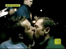
 Perhaps the most ironic thing about this opening sequence is that I CAN'T STAND that Christina Aguilera song--y'know, the one that says you're beautiful even though you're ugly and gay. >.< But even though I hate the original song, it's undeniable that "Beautiful" has become an anthem for the GLBTQ community. Personally, I've always been bitter about the song's success because the song itself was not aimed specifically at the GLBT community; the music video, on the other hand, prominently features a young gay couple. While browsing @ the iTunes Store, I fell in love with the 2009 "Beautiful" remix, retitled "You Are What You Are." I chose this song as the GLiTTER theme because Aguilera re-recorded the song, this time fully aware of the song/video's impact and importance to the GLBT community.
In terms of wardrobe, I was very particular about my outfit. After waiting two months for my sleeveless hoodie to arrive from 10Percent (aka Fabulous Gay HQ), I finally caved in, canceled the order, went to AMAZON and lo and behold, it arrived less than a week later. It was a perfect fit, and I love using the Pleasantville Effect to isolate the hoodie's bright teal trim.
It all ends with an homage to The Wizard Of Oz: the world around me becomes saturated with color as I jog past the Gettysburg College sign. It's definitely my favorite transition in the entire movie, but once again, it was a complex special effect. It may look simple, but that sequence is actually five cropped copies of the jogging sequence layered on top of each other, playing simultaneously. More than two hours were spent in the editing room trying to work out all the kinks in that 5-second segment.


No comments:
Post a Comment